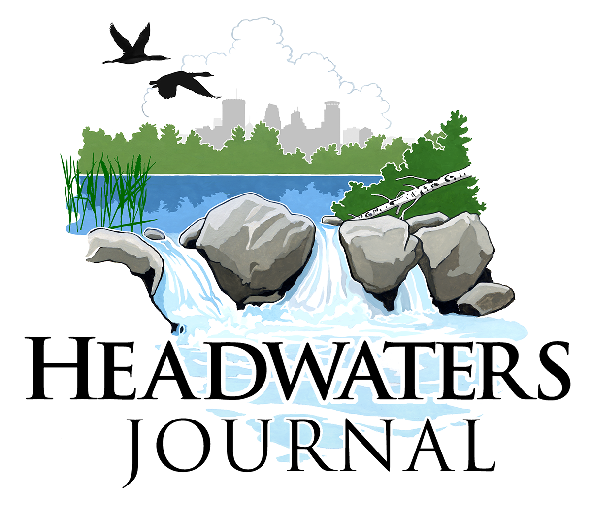
Episode 4 of Headwaters Journal takes a brief but meaningful pause before diving into cases and tradition-specific conversations. Host Arndt Bratten recaps the two foundational principles introduced in earlier episodes, then turns his attention to something that might seem small on the surface but carries a great deal of intention: the podcast's logo. What follows is a rich, symbol-by-symbol walk through an image designed to represent the entire spirit of the Headwaters project.
A Quick Recap: The Two Principles Guiding Headwaters Journal
Before unpacking the logo, Bratten briefly revisits the framework established in the first two episodes. The first principle is that health extends well beyond biological function, encompassing purpose, hope, faith, love, and reconciliation, all of which are genuine determinants of wellbeing that the medical community too often overlooks. The second principle addresses how Headwaters will approach the diversity of healing traditions, not by flattening them into a single universal message, but by using the railroad track metaphor, finding where traditions cross and converge around shared human experience, then honestly exploring where they diverge.
What Does the Name "Itasca" Actually Mean?
The logo is centered on the imagery of Lake Itasca, the headwaters of the Mississippi River in northern Minnesota. Bratten points out that the word "Itasca" is itself a constructed word, drawn from the Latin "veritas" meaning truth, and "caput" meaning head, yielding the phrase "true head." The still waters of the lake in the logo are meant to evoke reflection, a quality that nearly every great healing tradition values. From that stillness, the water begins to move, representing the dynamic, living quality of spirit, rendered as "pneuma" in Greek, "ruach" in Hebrew, and "spiritus" in Latin, and likely echoed in traditions and languages far beyond the Western world.
What Each Symbol in the Logo Represents
Every element in the Headwaters logo was chosen with care. The two geese in flight represent community, the reminder that we travel best when we are not alone. The cumulus clouds suggest transcendence, evoking for those in the Judeo-Christian tradition the image of a pillar of cloud leading people through a wilderness. The faint outline of Minneapolis in the background signals that Headwaters is not a retreat from civic life but a movement toward it, carried by the current of the river. In the foreground, wild rice honors the Anishinabe heritage of the region, representing connection to the land, to generations past, and to a sense of abundance that feeds both body and soul.
Why the Fallen Birch Tree Matters
One of the most quietly powerful symbols in the logo is a fallen birch tree in the foreground. Bratten is direct about its meaning: any tradition that claims to bring healing must be willing to look at death, grief, loss, and despair without turning away. Optimism that sidesteps the negative is not healing; it is avoidance. The fallen birch insists that real hope must be capable of holding sorrow. What do the great traditions say to people in the face of suffering, not around it? That is one of the central questions Headwaters intends to pursue.
Returning to the Sources: Why "Fonts" Matters
The deeper logic of the Itasca image, Bratten explains, is the invitation to return to the sources of one's tradition rather than drinking from the river further downstream, where the water has been mixed with countless other influences and is no longer clean at its origin. He uses the Latin word "fonts," meaning fountains or sources, as a watchword. Each tradition represented in the podcast will be encouraged to draw from its own deepest wells, not a diluted or abstracted version of itself. The purpose is not to pit traditions against one another, but to let each speak from its most authentic and nourishing place.
Two Colleagues, Not Competitors: A Model for the Work Ahead
Bratten closes the episode by introducing his fellow board member Dr. Tamim Shetty, a Muslim cleric, acknowledged teacher of Islam, and practicing pharmacist. The two men represent different traditions and will not always agree on diagnosis, treatment, or prognosis in a given case. But they share a foundational conviction: the truth will authenticate itself, and it does not require either of them to elbow the other aside. Like two physicians working through a difficult case together, they intend to collaborate for the good of the people in front of them. That spirit of collegiality, Bratten says, is precisely what the logo is meant to represent: a convergence of traditions in the public square, held together by a shared hope for understanding.
Notable Quotes from the Episode
"True insight and hope, meaning and spirit will have to acknowledge and address the negative: sadness, loss, grief, and despair, and integrate them into the healing process if they are to address our lives and the lives of our loved ones."
"You can never step in the same river twice. The river is constantly changing."
"The truth will authenticate itself. It does not need us to elbow or muscle each other away from the religion trough at the expense of the other."
"We are not trying to replace the traditional symbols, but rather trying to represent a convergence of those traditions in the public square for the sake of understanding and for a brighter future together."
"Go to the fountains. Go to the sources."